Xibeca presents a new image focused on its origins

The new design, inspired by the brand's historic labels, enhances its sharing spirit
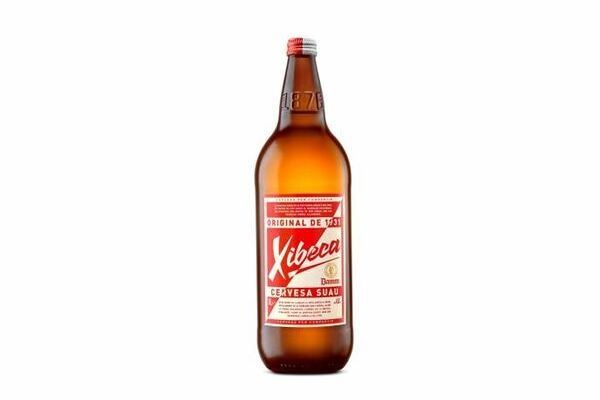
Xibeca's new image, released into the market last January 2021, shows a retro design inspired by the labels that used to adorn the brand's bottles before the 90s. The packaging also includes the message "original from 1931", which highlights the company's heritage, and enhances Xibeca's sharing motto.
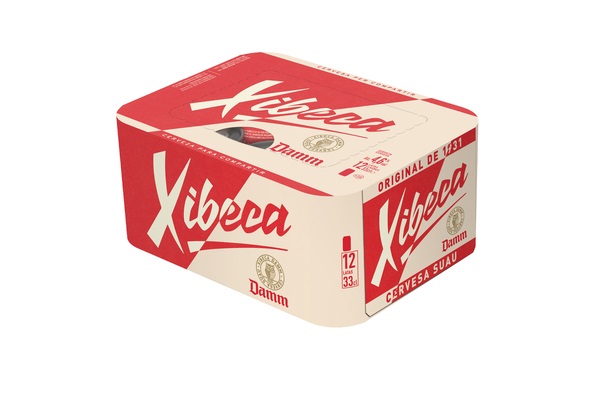
Besides, its strong commitment to sustainability has led the brand to go for a new pack format named LatCub® that allows to group cans together in a 100% biodegradable carton packaging produced with natural fibres sourced from PEFC-certified sustainably managed forests. In fact, 12 and 24 packs are completely produced without decorated shrink plastic wraps. Instead, they have been replaced with a carton packaging that is also PEFC-certified.
Fun fact: the name's etymology
The word Xibeca comes from a 1917 theater play about the bandit Rocabruna, in which one of the characters was a witch named Xibeca, who had a distinctive elongated shadow.
When Damm launched its large bottle, it became popularly known as Xibeca, as it reminded people of the witch's shadow. Eventually, Damm used this name to designate its one-liter bottle.